Project Description

About Silverwood Properties
Established in 2005 by real estate broker Ken Shapiro, Silverwood Properties is real estate agency located in Echo Park, a trendy Northeast Los Angeles community. Although Ken was the de facto “go-to guy” for Northeast L.A. (“NELA”) real estate, the company’s corporate identity did little to communicate that. Silverwood Properties was in need of a brand.
“We hired Studio AM to help us stand out in an overcrowded market and are we glad we did. They transformed our old website into an alluring new site with which has increased our online traffic and as a result, our sales. Studio AM also created our logo, business cards, billboard advertising and social media outlets, as well as many different kinds of promotional materials that we use on an on-going basis. They are very professional , efficient and have a keen sense of design aesthetics. As a result of their work, our brand name recognition is increased and our business is growing and expanding each year!”


Case Study – Before
Generic
Silverwood Properties’ website, logo and marketing materials sported a ‘me, too’ look that would have sufficed for any real estate agency. Ken’s trustworthiness and specialized knowledge of the Northeast L.A. real estate market were not given the emphasis they deserve.
Bit and Piece Design
Like many small businesses, Silverwood Properties created its logo, website, advertising, fliers and other marketing materials as the need arose. Consequently, the design of each diffed, thus preventing the firm from building a recognizable visual identity.
Where to Begin?
Ken and his wife Paula were very aware of the need to differentiate Silverwood Properties from its rivals but didn’t know where to begin. While graphic designers were plentiful , Silverwood needed a firm which could deliver branding with striking graphics and a new website with effective search engine optimization.
Effective Online Presence
The Shapiros hired Studio AM and played an valuable role in the branding process.
Case Study – After
In collaboration with Ken and Paula, Studio AM did the following:
Identified Silverwood Properties with the NELA Community
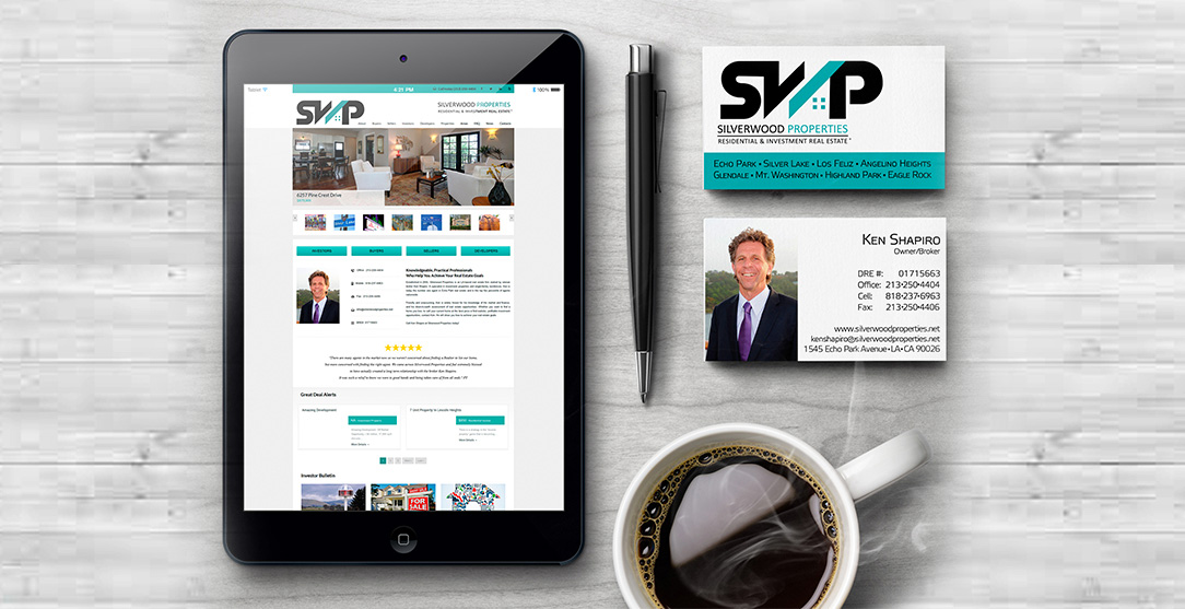
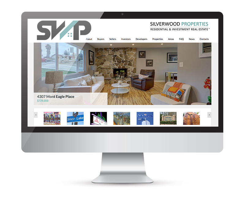
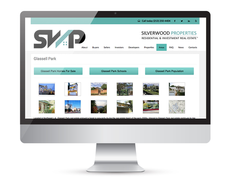
The Silverwood Properties website was redesigned to visually reflect the feel of NELA, a region known for its allure to artists, hipsters and multiunit real estate investors. The new site design was fresh and hip with a more youthful feel.
Expanded NELA Focus
More emphasis was placed on Ken’s in-depth knowledge of the NELA market and his caring, trustworthy nature. Additionally, the site was expanded to add content on each of Silverwood Properties’ NELA communities so site visitors could acquire a feel for what each neighborhood had to offer such as local schools and demographics.
Savvy Search Engine Optimization
The well-known catchphrase “build it and they will come” doesn’t apply to Internet marketing. And so, Studio AM devised a comprehensive SEO program for the new site which directly boosted its search engine rankings.
Distinctive New Logo
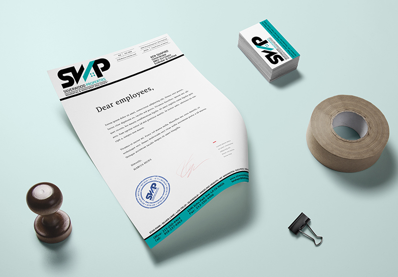
Studio AM created a one-of-a-kind logo for Silverwood Properties with an ultra-contemporary feel and further reflected the tastes of its target audiences. The logo was uniquely recognizable as the Silverwood Properties’ brand.
Unified Design
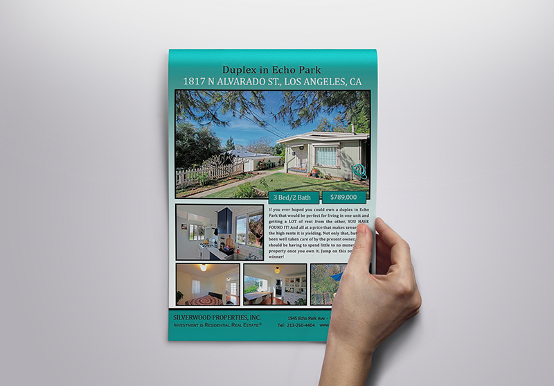
The new branding design theme was carried through all of Silverwood Properties’ marketing materials, advertising and email marketing.
The Results – Continuous Growth
Silverwood Properties’ branding strategy worked and continues to do so. The company enjoys increased website traffic and sales along with year-to-year revenue growth.
