
Sol Pilates Studio
Sol Pilates Studio needed a brand identity that reflected the physical and philosophical nature of the practice. Pilates is a discipline defined by precision, balance, and controlled movement — and the brand had to communicate those qualities immediately, across every touchpoint from the studio wall to the water bottle a client carries home.
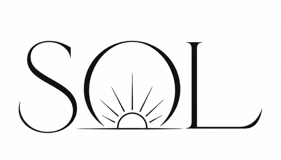
The identity development began with the core brand concepts: alignment, balance, energy, and flow. These four principles informed every design decision — from the logo mark to the icon system to the color palette. The sunrise reference in the name gave us a visual anchor: warmth without being soft, energy without being aggressive, clarity without being clinical.
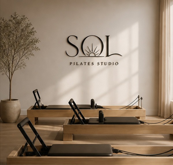
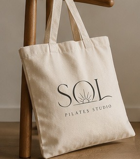
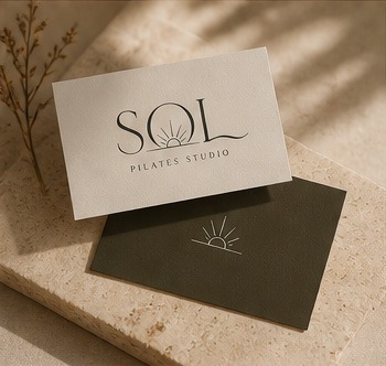
Logo design explored multiple directions before arriving at a mark that holds its own at the scale of environmental signage and at the small scale of a business card. The variation system gives the brand flexibility across applications while maintaining a consistent core identity.
The full project scope covered logo design with multiple variations, product packaging, printed collateral, and environmental design for the studio space itself. Every element was developed to feel like part of a coherent system — so that the brand reads as professional and intentional whether a client encounters it on the street, in the studio, or through a branded product.
The result is a brand identity that matches the quality and intentionality of the practice it represents.

 V.01
V.01 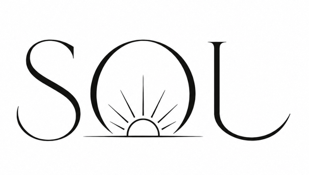 V.02
V.02 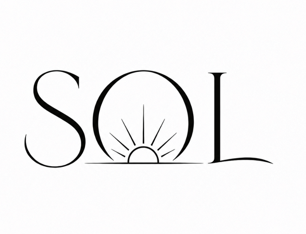 V.03
V.03 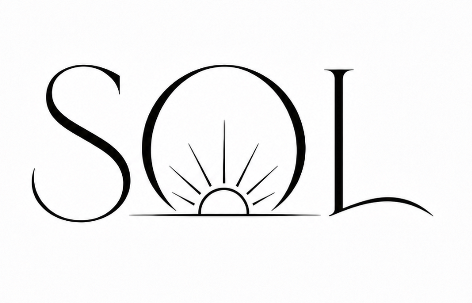 V.05
V.05 
Alignment
Represents posture, structure, and the importance of aligned movement.

Balance
Symbolizes centeredness, stability, and harmony in body and mind.

Energy
Reflects vitality, strength, and the inner energy that drives transformation.

Flow
Captures movement, fluidity, and the continuous rhythm of progress.
Ready to start your project?
Let's work together to build something great. Tell us about your project and we'll get back to you within 24 hours.