
A new website for a Los Angeles general contractor that puts commercial, renovation, ADU and ground-up work side by side on one light, brand-led page.
The Challenge
New Generation Improvements is a Los Angeles general contractor run by husband-and-wife team Mario and Marisela Arechiga. Over the years it built a strong residential reputation, with work featured in Architectural Digest, on HGTV’s House Hunters and on CBS. The business now spans four lines of work: commercial tenant improvements, renovations, ADUs and ground-up construction.
The existing site led with residential work. Commercial clients such as owners, operators and property managers had to look hard to see the company as a builder for them. The question for the homepage was how to bring commercial forward without losing the homeowners who already trust the brand.
Our Approach
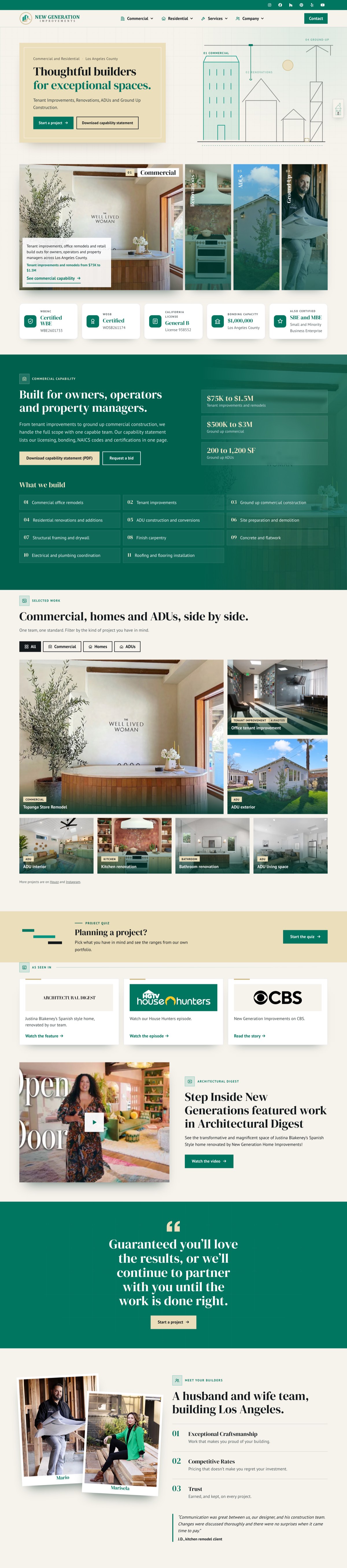
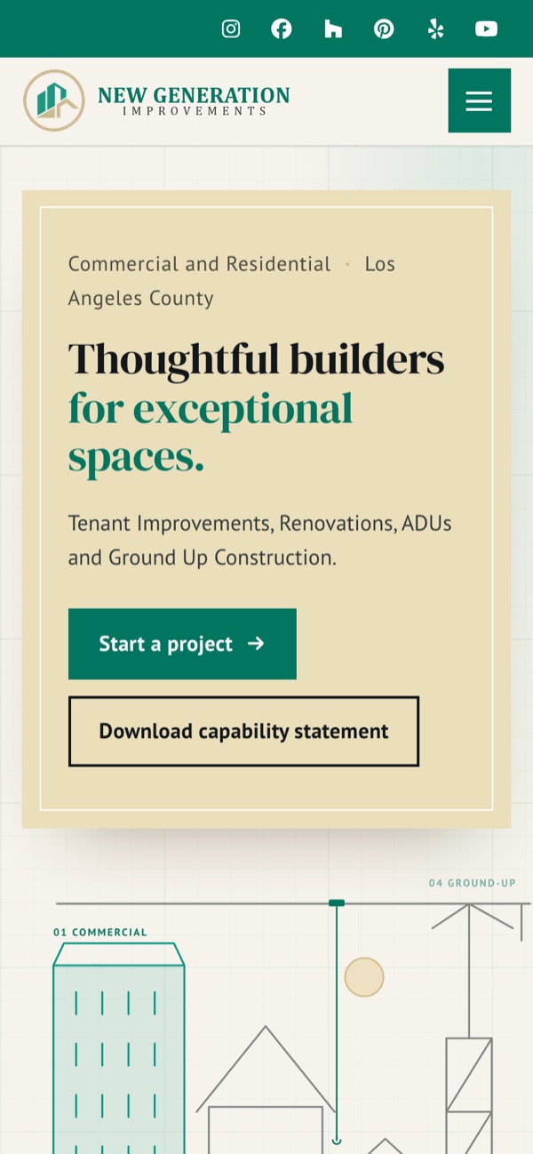
We designed one site with no audience picker. The hero gives four equal pillars, Commercial, Renovations, ADUs and Ground-Up, the same weight. Beside them, an animated line drawing of an office block, a house, an ADU and a crane on a blueprint grid highlights in step with whichever pillar is active. Below that, a deep green capability section sets out project ranges, what the company builds and a downloadable capability statement. A credentials strip shows licensing, bonding and certifications.
The residential proof stays: a filterable project grid, the press features, the founders and client reviews. ADUs link out to the company’s dedicated ADU site.
The client asked for a light top rather than a dark one, so the page uses a paper background, the brand’s green and teal, and the wheat tone from the old hero. Headlines are set in DM Serif Display, which the client’s side chose from a live font comparison. We kept the original green for decoration and deepened it for text and buttons so they pass AA contrast. Every corner is square, also at the client’s request.
The Result
The new site is live at newgenerationimprovements.com, replacing the client’s WordPress site.
Results
- One homepage for four lines of work, with no audience picker
- Animated line drawing that tracks the active service pillar
- Commercial capability and certifications brought to the front
- Brand green adjusted so text and buttons meet WCAG AA contrast
01Deep green commercial capability section with project value ranges and a list of what the company builds
02Selected work grid with filters for commercial, homes and ADUs
03As seen in strip with Architectural Digest, HGTV House Hunters and CBS, above a featured video
04Meet your builders section with polaroid-style photos of Mario and Marisela and three principles
 Next Project Im Srti Tnaky
Ready to start your project?
Let's work together to build something great. Tell us about your project and we'll get back to you within 24 hours.